
Overview
The goal of this data science project is to compile information on covid cases in NYC in the past couple months and show the change in cases before and after the easing of lockdown and restrictions. This project uses NYC public data information on covid to analyze the relationships between vaccinations, dates and covid cases. This project also aims to better visualize the effects of NYC easing lockdown amid vaccine hesitancy and the emergence of covid variants like Delta and Omicron.
Covid Cases in NYC Visualization and Analysis
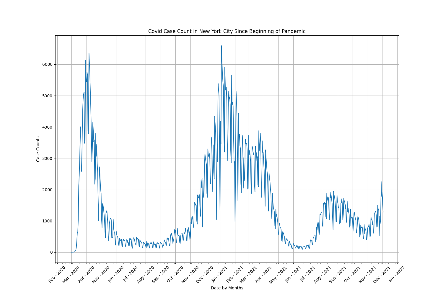
Covid Cases Over The Course of the Pandemic
The line graph below shows the timeline of covid cases in NYC during the pandemic. We can see that at the beginning of the pandemic in February 2020 there was a spike in covid cases, but then when strict lockdown measures were implemented, cases decreased drastically. However, during the holiday season and especially New Year’s between December 2020 and January 2021, people began to ignore lockdown measures and cases inreased and peaked at 6953 cases in a day on January 4, 2021. After February 2021, people began to get vaccinated and cases dropped once again. However in August 2021, Governor Andrew M. Cuomo began to ease the lockdown restrictions and reopen NYC and we can see covid cases begin to increase again.
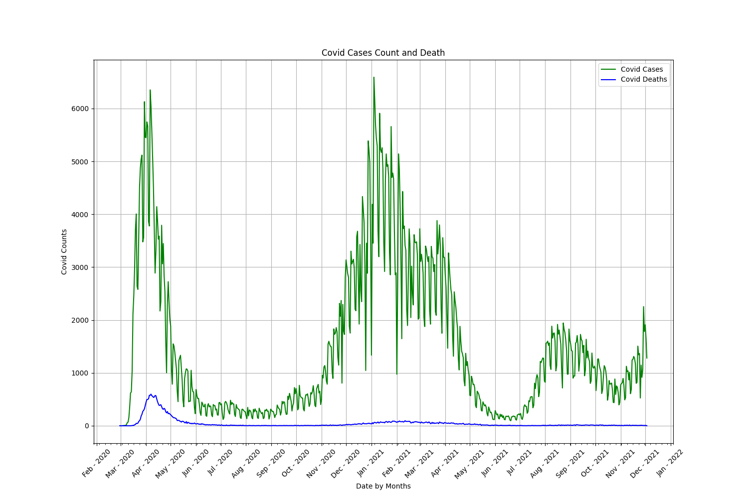
Covid Cases and Deaths Over The Course of the Pandemic
The line graph below shows the timeline of covid cases and deaths in NYC during the pandemic. As we can see, at the beginning of the pandemic covid deaths spiked along with covid cases, but afterwards covid deaths remain relatively low compared to the number of cases. Even during the spike in covid cases during the holiday season, covid deaths did did not increase much, which means that more and more people were recovering from covid.
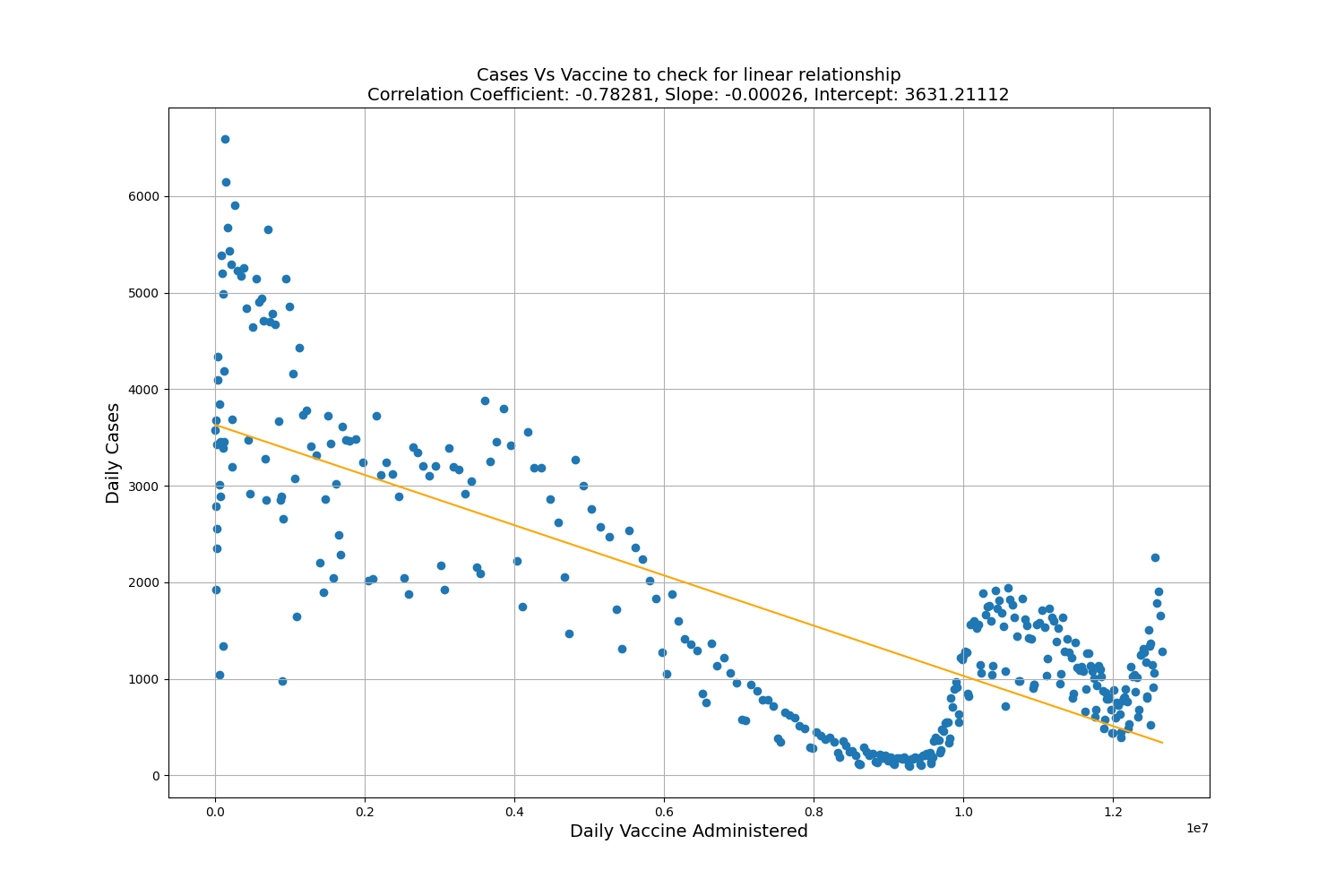
Linear Relationship Between Vaccination and Covid Cases
Before performing linear regression we first check if a linear relationship exists between vaccination and covid cases. As we can see their is a correlation between the two. As more people became vaccinated, we can see a linear decrease in covid cases in NYC. Furthermore we can see that the vaccinations on the x-axis are being displayed with scientific notation of 1e7.
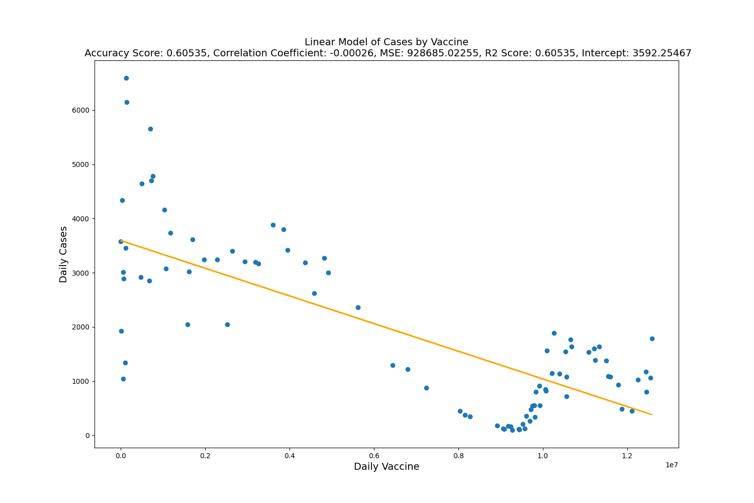
Linear Regression on Vaccine and Cases
Using linear regression with vaccine as independent variable and covid cases as dependednt variable. As you can see, the model has decent accuracy against the testing data of only 0.60535 or 61% accuracy. As well as a Mean Squared Error of 928685 and a correlation coefficient of -0.00026.
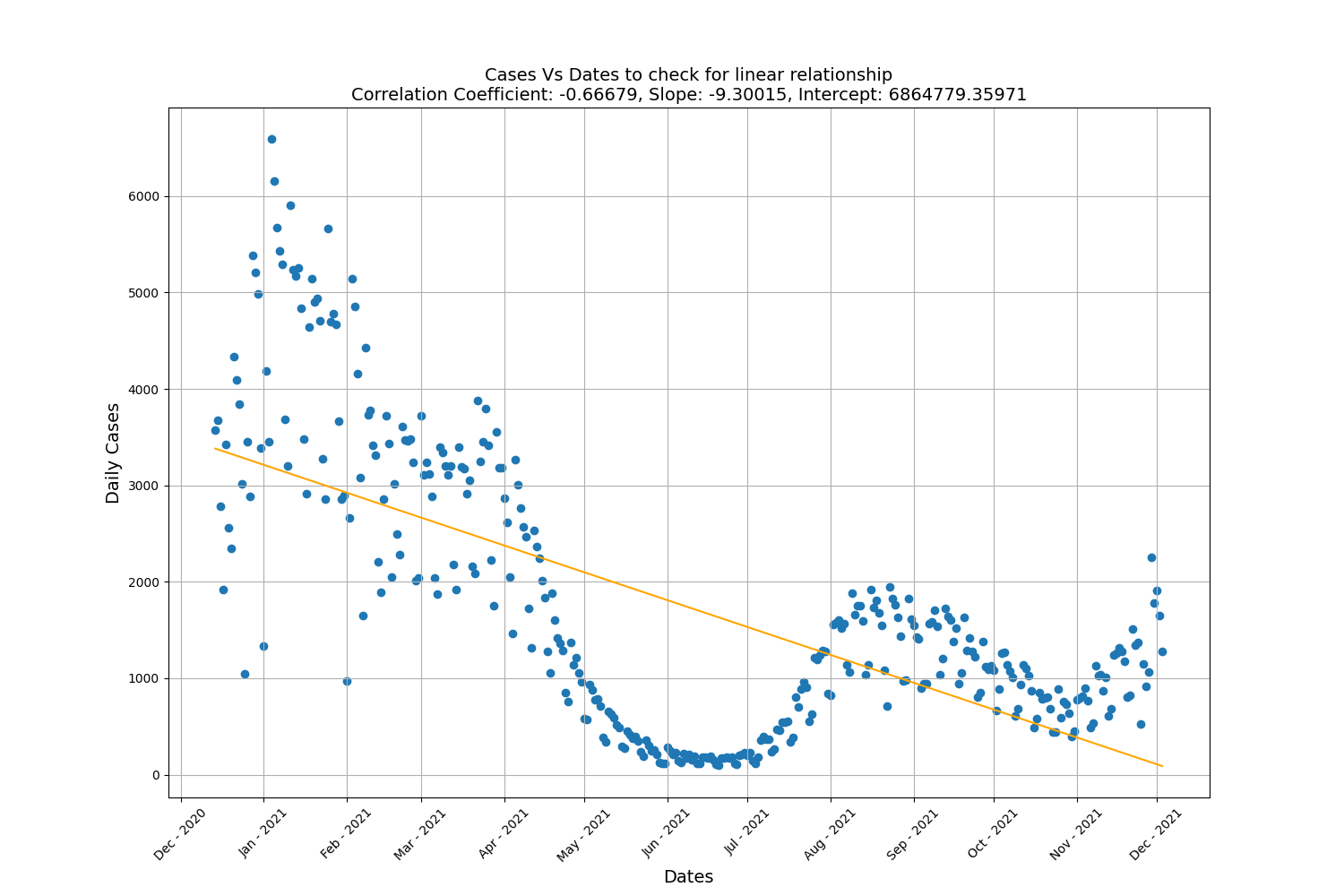
Linear Relationship Between Covid Cases and Dates Over Time
Before performing linear regression we first check if a linear relationship exists with covid cases and dates over time. As we can see their is a correlation between the two. Over time, we can see a fairly linear decrease in covid cases in NYC.
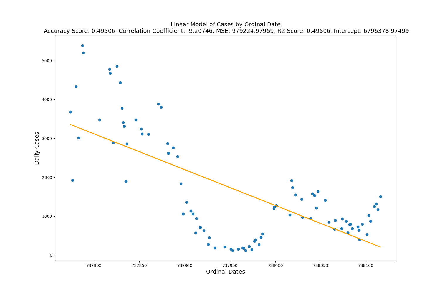
Linear Regression on Vaccine and Dates Over Time
Using linear regression with dates over time as independent varaiable and covid cases as dependent variable. As you can see, the model has a fairly low accuracy against the testing data of only 0.49506 or 50% accuracy. As well as a Mean Squared Error of 979224.
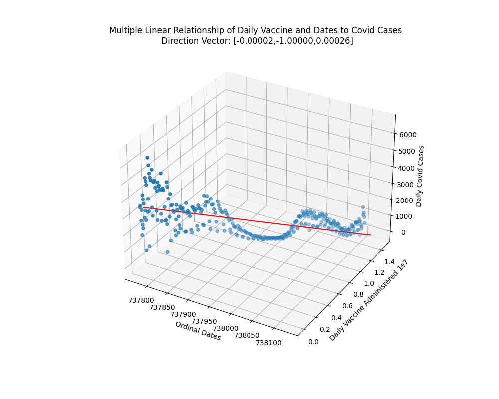
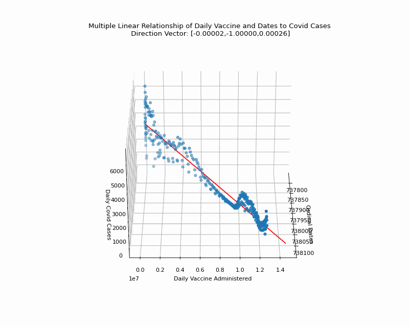
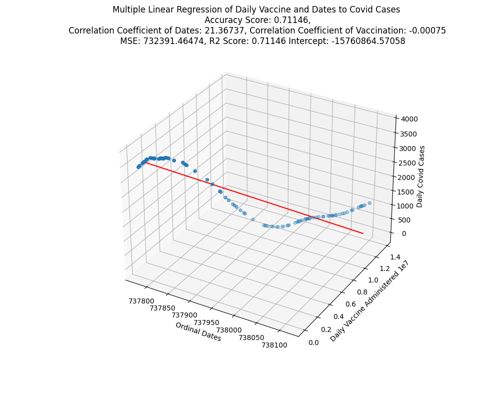
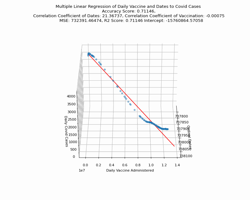
Multi Linear Relationship Between Covid Cases and Vaccination, Dates Over Time
Before performing multi linear regression we first check if a multi linear relationship exists between vaccines and dates over time to covid cases. We can see that over time as more people became vaccinated, covid cases decreased. Additionally, for this analysis datetime needed to be converted to ordinal date format.
Multi Linear Regression Between Covid Cases and Vaccination, Dates Over Time
After performing multi linear regression with vaccine and dates as our independent variables and covid cases as the dependent variable to be predicted. we can see that we have a good R-Squared score of 0.71146 or 71% accuracy in our training model against the testing data of vaccinations and date over time. The coefficient for dates is 21.36737 and the coefficient for vaccines are -0.00075 and our MSE is 732391.
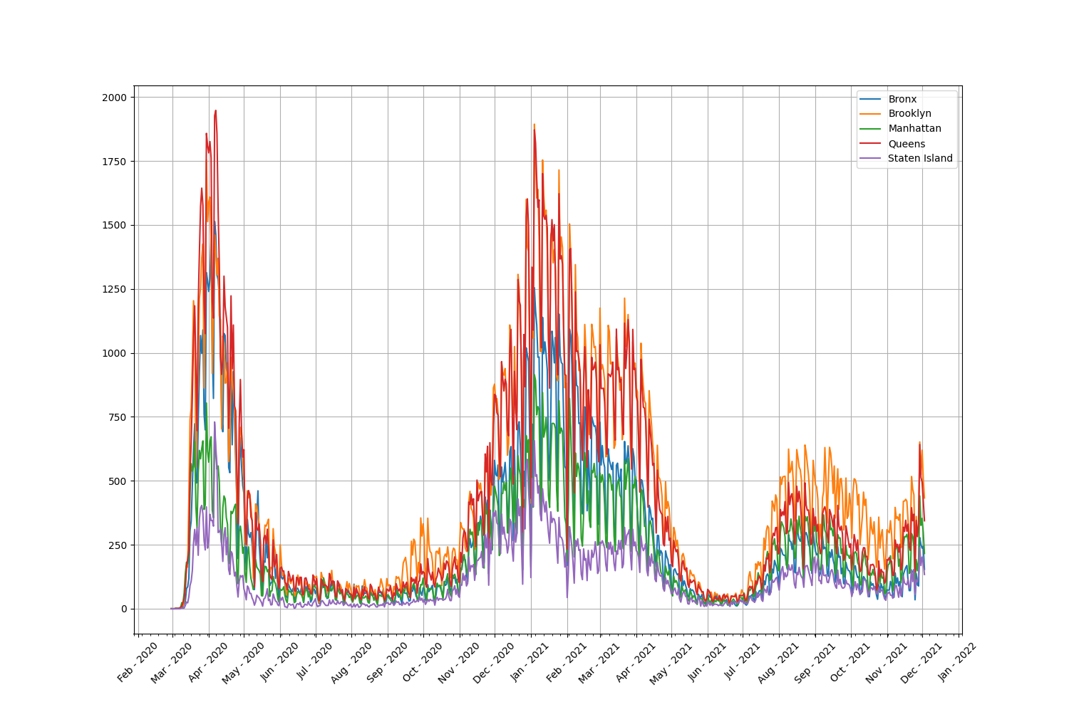
Line Graph of Cases By Borough
Below is a line chart of all cases by each NYC borough. As we can see, Brooklyn and Queens make up a majority of the cases.
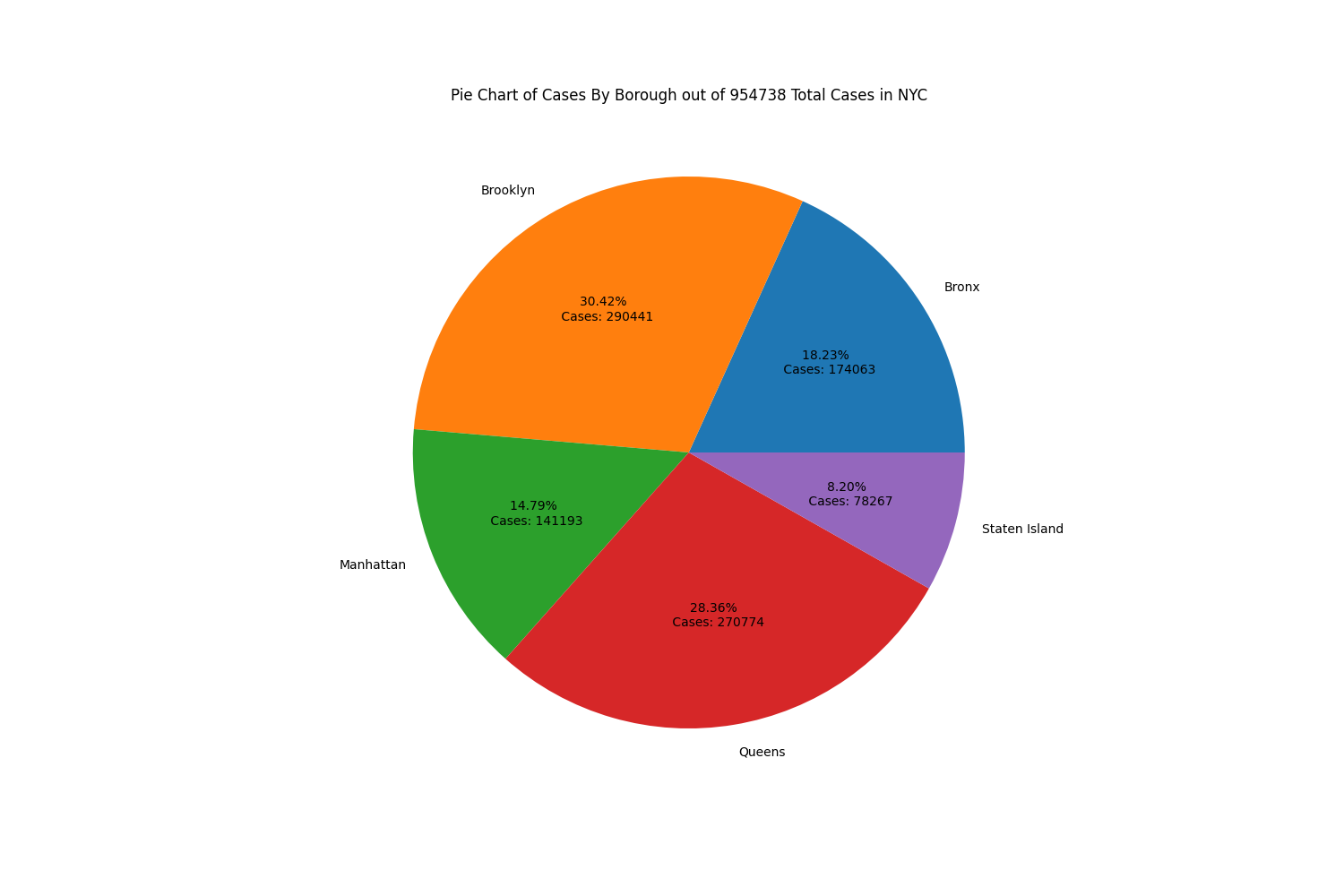
Pie Chart of Cases By Borough
The pie chart further shows how many covid cases occur in Brooklyn and Queens with percentages of 30.42% and 28.36% respectively or a total of 58.78% of the covid cases in NYC. This may be due to Brooklyn and Queens being suburban areas where people are more likely to not wear masks and follow covid protocols. Unlike in Manhattan, where even though it is more population dense, people are more cautious by wearing masks and strictly following protocols.
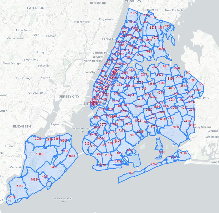
Map of Cases By MODZCTA
Below is a folium map of NYC split into MODZCTA, which are essentially modified ZIP codes used by the NYC Health Department. The covid cases in each MODZCTA is displayed in red.
Techniques
I used Python libraries like pandas to load and clean csv data and numpy to calculate slope, intercept and correlation for some of my graphs. For the analysis done on vaccine data to covid case data I had to use pandasql to perform a inner join on the two dataframes where the dates matched. This is because the vaccine was not available at the start of the pandemic and I had to filter out rows in the covid cases data where vaccine data did not exist. After this I used Linear Regression from the sklearn python library to analyze and predict relations between covid cases to vaccination and covid cases over time. In addition, I used train_test_split to randomly split my data into training and testing data to train and compare the results to my linear regression models. Next, I performed Multi Linear Regression on vaccination and dates to covid cases. However, because linear regression doesn’t work with datetime data, the dates were converted to a numeric ordinal format using the datetime library. Additionally, I used sklearn PCA to calculate the direction vectors for the multi linear regression models. I used matplotlib to display the graphs created and matplotlib animations was used to create rotating gifs of the 3D models. Finally, I used folium to map the number of covid cases in each MODZCTA.
Conclusion
In conclusion, according to the visualizations and linear regression analysis performed, as more and more people get vaccinated over time, covid cases will decrease. However, we can see that the easing of lockdown restrictions affected the number of covid cases and caused an increase. We can also conclude that suburban areas like Brooklyn and Queens contribute the most to total covid cases in NYC compared to other boroughs.
Citation
Data Sources:
- https://github.com/nychealth/covid-vaccine-data/blob/main/doses/doses-by-day.csv
- https://github.com/nychealth/coronavirus-data/blob/master/totals/data-by-modzcta.csv
- https://github.com/nychealth/coronavirus-data/blob/master/trends/data-by-day.csv
- https://github.com/nychealth/coronavirus-data/blob/master/Geography-resources/MODZCTA_2010_WGS1984.geo.json
Additional Resources:
- https://stackoverflow.com/questions/65888553/fitting-a-line-through-3d-x-y-z-scatter-plot-data
- https://stackoverflow.com/questions/51457738/animating-a-3d-scatterplot-with-matplotlib-to-gif-ends-up-empty
- https://stackoverflow.com/questions/60252480/how-to-plot-3d-multiple-linear-regression-with-2-features-using-matplotlib